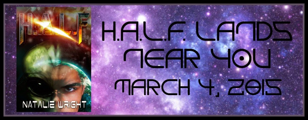
A huge thank you to all of you that gave me input on the last round of cover designs for my newest novel, H.A.L.F. What insight! But we had a tie between two choices. So I went back to the designer and asked for few tweaks and we’re down to two concepts. I’d appreciate your help once again and let me know your vote between these two options. Thanks y’all!
 |
| Option #1 (Please note if this option is chosen, it will have the title lettering like Option #2 below) |
 |
| Option #2 |
Leave me a comment or head over to my Facebook page and vote there – http://www.facebook.com/NatalieWright.Author
THANKS!


I like both of them a lot. I'm thinking the first one, because it is cleaner? Less stuff on it?
LikeLike
I like the top one better because it's not as busy. That makes for sharper contract between lettering and background, and an easier to read title.
LikeLike
Thanks Pauline and good points. I agree it's hard to get both faces on the page and not have it end up looking crowded.
LikeLike
I like the first option best. The single (character) focus really draws the viewer in. The second option is too busy.
LikeLike
Thanks for stopping by and commenting Laurie. It's a close vote right now! A lot of YA writers like seeing the girl on the page, but just as many like the less cluttered look of option 1. I may have to flip a coin ; )
LikeLike
Thanks Sarah for your comment. Option 1 is pulling ahead!
LikeLike
I prefer the top one. The second one is a little too cluttered, and that bright flash across the middle would make a thumbnail sized image (which is all you'll get to see in some places) harder to read.
LikeLike
I like the first one better. It drew my interest right in. The second one is…off somehow. Maybe it's that bright beam of light. The full face of the character is also somehow throwing it off. I really like that you can only see his eyes in the first cover.
I read the other comments and your replies (hope that's okay) and I get what you're saying about having the female character included. Perhaps the letters of the title can be moved down a little on the first cover like they are on the second and she can be placed in the same spot on the first cover? That might make it perfect. 🙂
LikeLike
You're right Pippa – we always need to keep in mind it could be seen in black & white and/or really small. Thanks for your help
LikeLike
Thanks for your help Kyndra. I was thinking that too – that moving it all down we might be able to get her face on the cover. But then it would clutter it?!
LikeLike
Hi Natalie, just at a glance, I like the first one best. It appeals more. I see it is a popular choice. I wasn't influenced, promise!
LikeLike
Thanks for your vote Kaye!
LikeLike
It might…Shoot, that's a toughie…
LikeLike